Form Fields & Builder Growth+This feature requires the Growth+ plan or higher
The form builder is where you design the layout of your waivers and forms. You can add, arrange, and configure fields to collect exactly the information your business needs.
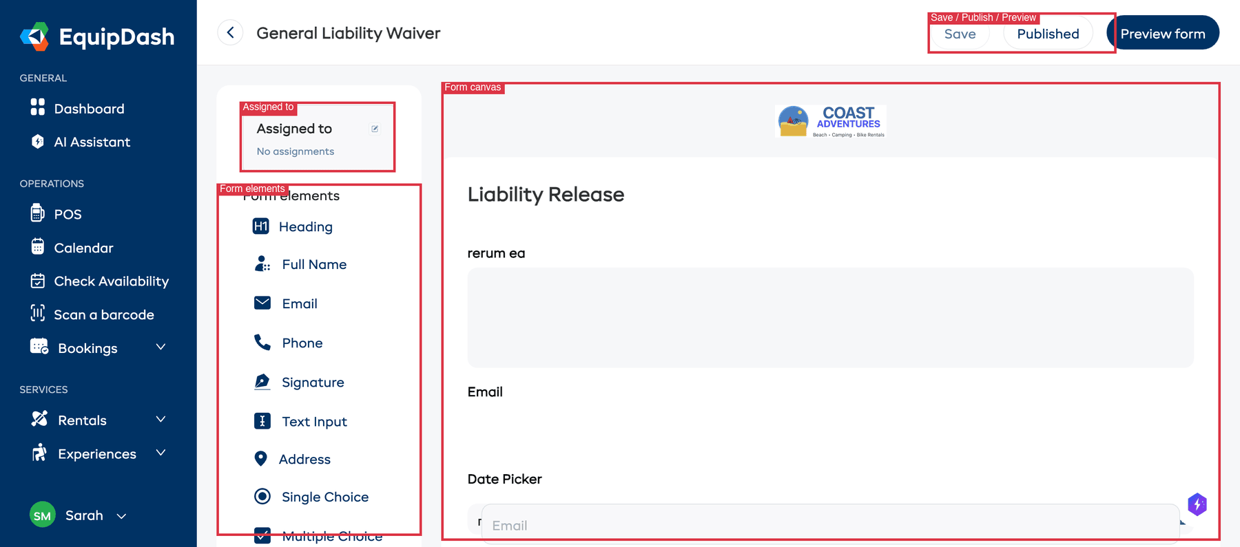
The Builder Interface
The form builder is split into several areas:
- Top bar — Shows the form name (with a back arrow), plus Save, Published/Publish, and Preview form buttons.
- Assigned to (top-left) — Shows which products and experiences the form is currently assigned to, with an edit icon to change assignments.
- Form elements panel (left sidebar) — A list of all available field types. Click any element to add it to your form.
- Form canvas (centre) — The main area where your form takes shape. Fields appear here in the order customers will see them. Your business logo is shown at the top.
Available Field Types
The following elements are available in the Form elements panel:
| Element | Description | Use Case |
|---|---|---|
| Heading | A heading for organising form sections | Separating form sections (e.g., "Personal Details", "Health Information") |
| Full Name | A combined first name and last name field | Collecting the customer's full name |
| A text input with email validation | Collecting email addresses | |
| Phone | A text input for phone numbers | Contact numbers |
| Signature | A signature pad for e-signatures | Waivers, rental agreements, liability releases |
| Text Input | A multi-line text area | Comments, special requests, medical notes, legal text |
| Address | A structured address field with multiple sub-fields | Collecting full mailing addresses |
| Single Choice | A set of options where only one can be selected | Yes/No questions, skill level, t-shirt size |
| Multiple Choice | A set of options where multiple can be selected | Interests, dietary requirements, equipment needed |
| Additional Logo | Adds an extra logo or image to the form | Branding, partner logos |
| Date Picker | A date selection field | Date of birth, arrival date |
| Short Text | A single-line text input | Names, short answers, reference numbers |
| Long Text | A larger multi-line text area | Detailed descriptions, additional information |
| Star Rating | A 1–5 star rating selector | Feedback ratings, experience ratings |
| Text Block | A block of static text that is not a form field | Instructions, legal disclaimers, explanations |
Adding a Field
- In the Form elements panel on the left, click the field type you want to add.
- The field is added to the bottom of the form canvas.
- Click on the field in the canvas to select it — an edit icon (pencil) and delete icon (trash) appear on the right side of the field.
Editing a Field
- Click on a field in the form canvas to select it.
- Click the edit icon (pencil) that appears on the right side.
- The Edit Field sidebar panel opens with settings for that field.
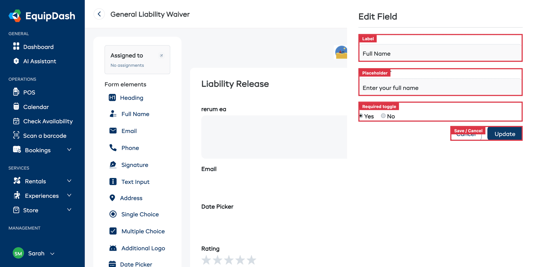
Common settings include:
- Label — The question or label shown to the customer (e.g., "Full Name", "Do you have any medical conditions?").
- Placeholder — Hint text inside the field before the customer types.
- Required? — Choose Yes or No to set whether the field must be filled in before the form can be submitted.
- Options — For Single Choice and Multiple Choice fields, enter the list of choices.
- Click Update to save your changes, or Cancel to discard them.
Deleting a Field
- Click on the field in the form canvas to select it.
- Click the delete icon (red trash) that appears on the right side.
- The field is removed from the form.
Multi-Page Forms
You can split longer forms into multiple pages:
- Scroll to the bottom of the form canvas.
- Click Add New Page to create a new page.
- Add fields to each page as needed.
- Each page shows a "Page X" header and a Delete Page button (if there is more than one page).
Customers will see one page at a time and navigate between them.
Tips for Building Great Forms
- Keep it short. Only ask for information you genuinely need. Long forms lead to lower completion rates.
- Use headings and text blocks. Break up longer forms into logical sections so they feel less overwhelming.
- Mark the right fields as required. Essential fields like name and signature should be required, but optional fields (like "any comments?") should not be.
- Preview before publishing. Always use the Preview form button to see what the form looks like to customers.