Customer Details & History
Every customer in EquipDash has a detail page where you can see everything about them in one place — contact information, booking history, emails, SMS, waivers, surveys, and a timeline of every event. The page is organised as a hero card at the top and a 5-tab workspace below.
Opening a Customer Profile
- Click Customers in the sidebar.
- Find the customer in the table (use the search bar if needed).
- Click anywhere on the customer's row to open their detail page.
Page Layout
The page is laid out top-to-bottom:
- Header — Back arrow, the customer's name, their ID, and an Edit Customer button.
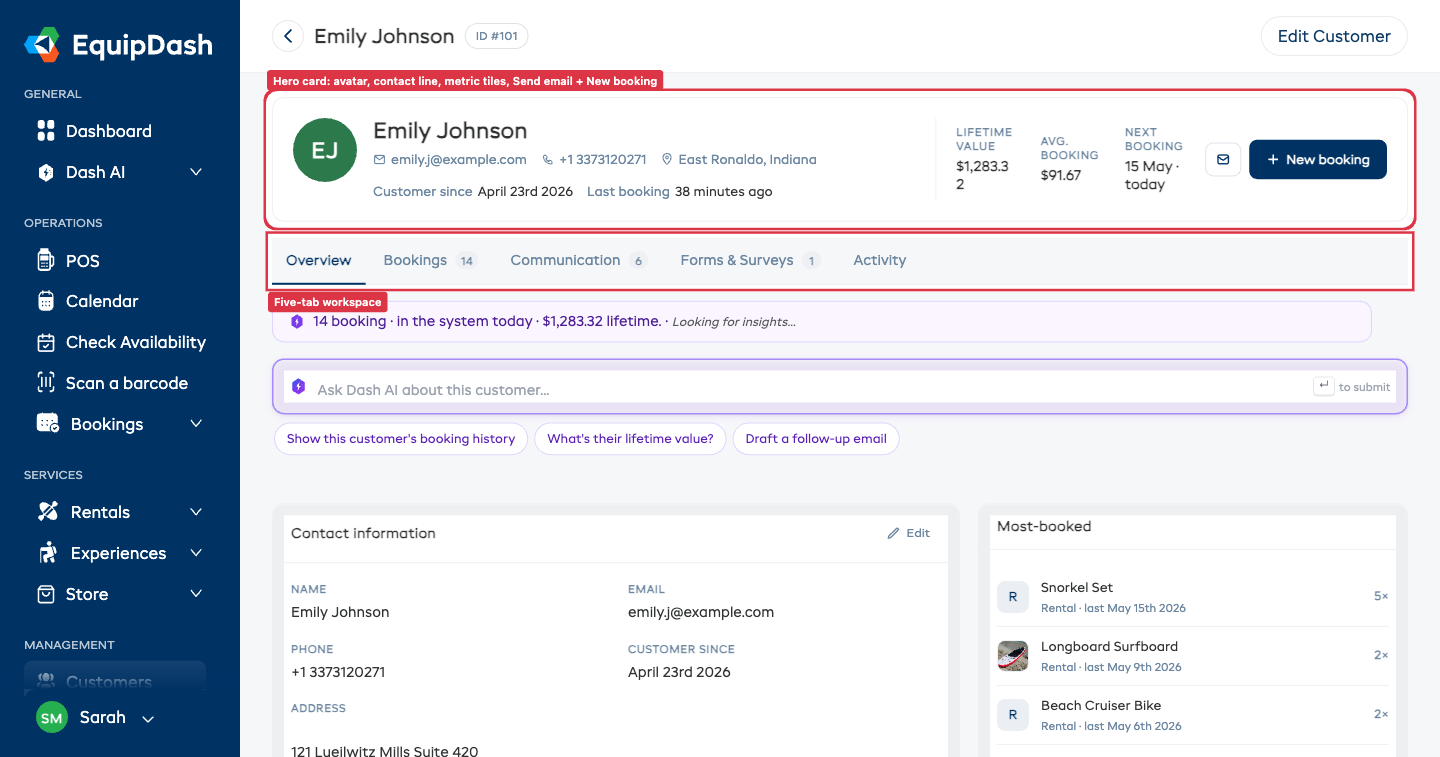
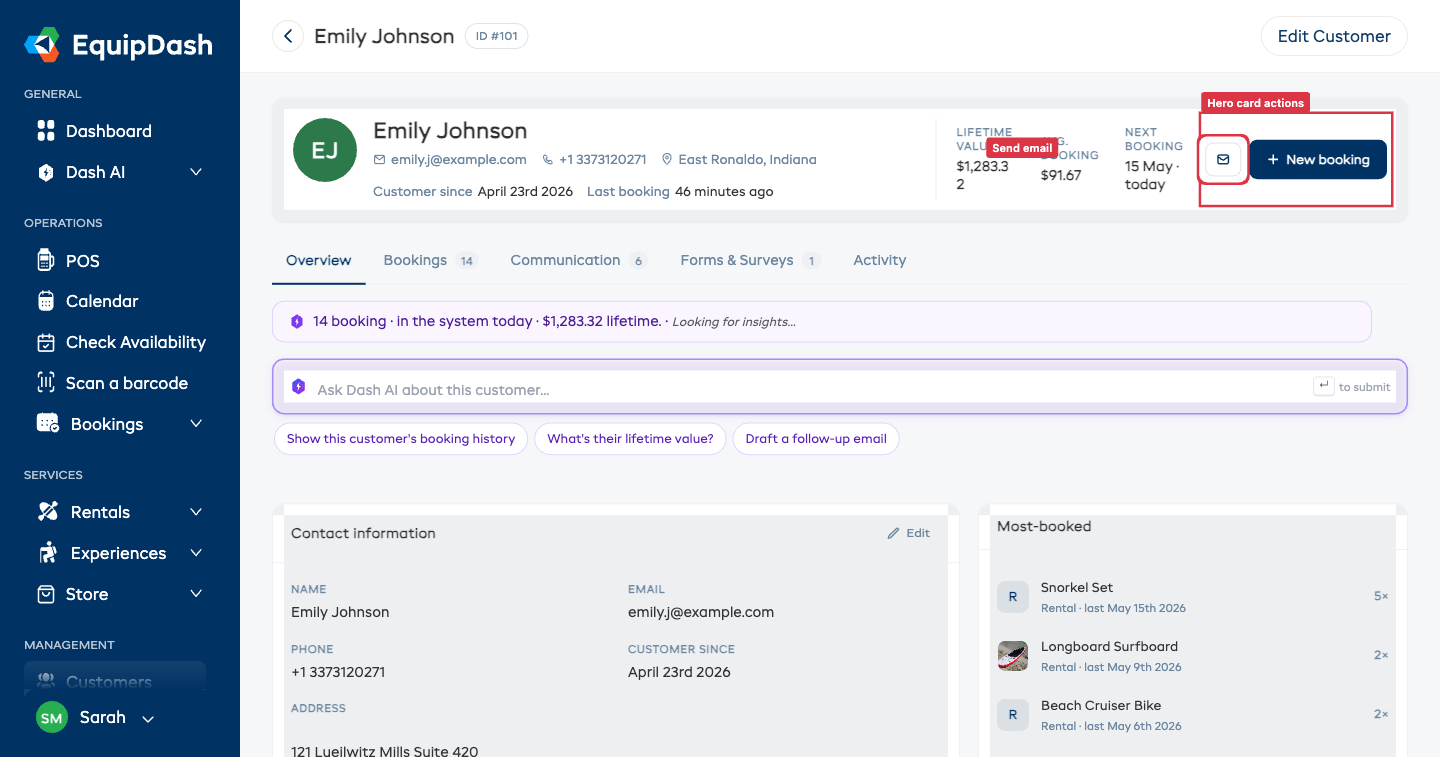
- Hero card — Avatar (their initials on a stable colour), contact line (email, phone, location, customer since, last booking), three metric tiles (Lifetime value, Avg. booking, Next booking), and two action buttons (Send email and + New booking).
- Tab strip — Five tabs: Overview, Bookings, Communication, Forms & Surveys, Activity. Counts next to each tab name show how much is in that tab.
- Dash AI band — Insight pill and an Ask Dash AI input you can use on any tab.
- Tab body — Content for whichever tab is selected.
The tab you're on is preserved in the URL (?activeTab=overview / bookings / etc.) so you can bookmark or share a link to a specific tab.
Hero Card
The hero card is your at-a-glance dashboard for the customer. It shows:
- Avatar — The customer's initials on a coloured circle. The colour is stable per customer so you can recognise them at a glance.
- Name + ID — Full name in the header, ID pill (
ID #101) next to it. - Contact line — Email (mailto link), phone (tel link), location, "Customer since
{date}", and "Last booking{relative time}". Each segment is hidden when there's no value. - Metric tiles:
- Lifetime value — Total spent across non-cancelled bookings (tax-inclusive).
- Avg. booking — Average per booking.
- Next booking — Date of their next confirmed booking, or "None" if there isn't one. Clicking it opens that booking.
- Action buttons:
- Send email — Opens the Send custom email side panel.
- + New booking — Jumps to the POS with this customer already selected.
Overview Tab
The default tab. Two columns:
- Left column — Contact information, Custom fields (if configured), and Notes.
- Right rail — Most-booked items (top 5 services this customer has booked, with thumbnails when the product has an uploaded image).
Contact Information — Inline Edit
The Contact information card lets you update most fields without opening a side panel.
- Click the Edit pencil at the top-right of the Contact information card.
- The card flips to edit mode and the pencil turns into a Done button.
- Edit any field. Each field auto-saves the moment you click out of it (on blur) — there is no separate save button.
- Click Done at the top-right (or the Edit Customer button in the page header) when you're finished.
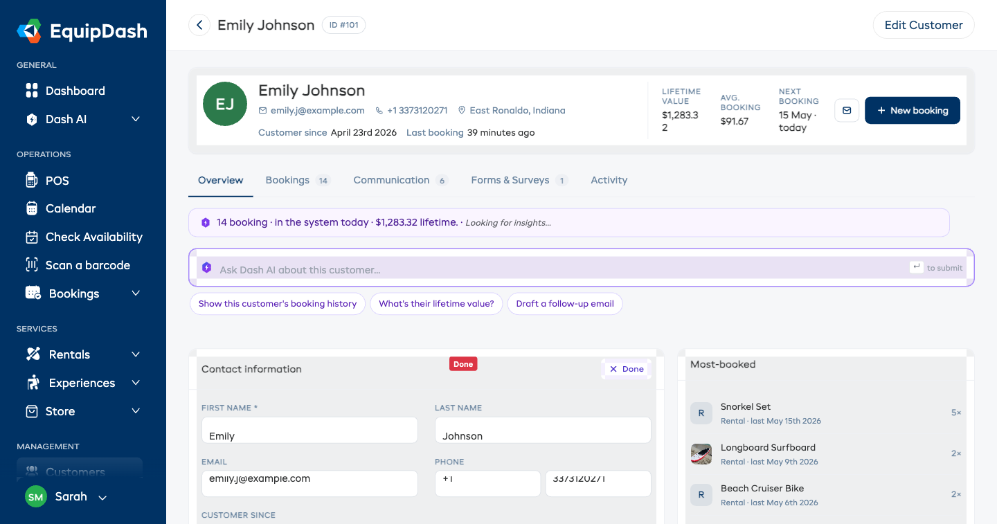
If you enter an invalid value (e.g. a duplicate email that another customer at your business already uses), the field reverts and you'll see an error toast.
For the country dropdown, click the field — a styled selector with country flags opens.
Edit Customer Modal (Fallback)
The page header still has an Edit Customer button that opens the old side-panel form. Use it when you want to:
- Edit many fields at once with a single Save click.
- Set custom field values (custom fields are read-only on the inline panel).
- Set the date of birth (DOB) or gender — these are not on the inline card.
Notes
Internal notes about the customer. See Customer Notes for the full guide.
Most-booked
The right-rail card lists up to 5 products / experiences this customer has booked most often, showing the thumbnail (when available), the type (Rental / Experience), the last-booked date, and the count. Clicking a row opens the product or experience detail page.
Bookings Tab
The Bookings tab is the global bookings table scoped to this customer. Same toolbar, same filters, same row actions as the main Bookings page — just pre-filtered to this customer.
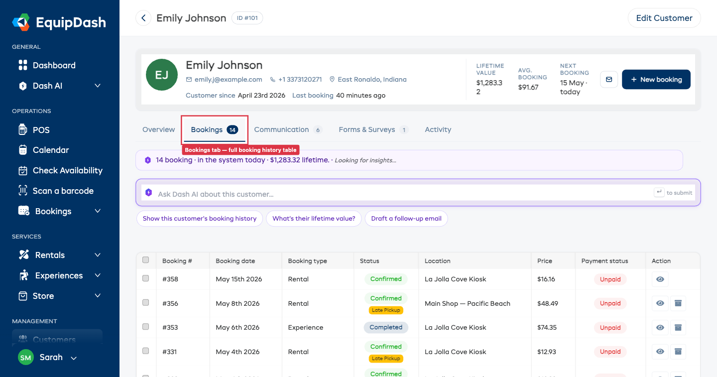
Use it to:
- Audit a customer's booking pattern.
- Spot late pickups / late returns.
- See which bookings still have an outstanding balance (the Payment status column).
Communication Tab
A read-only chronological timeline of every email and SMS this customer has received.
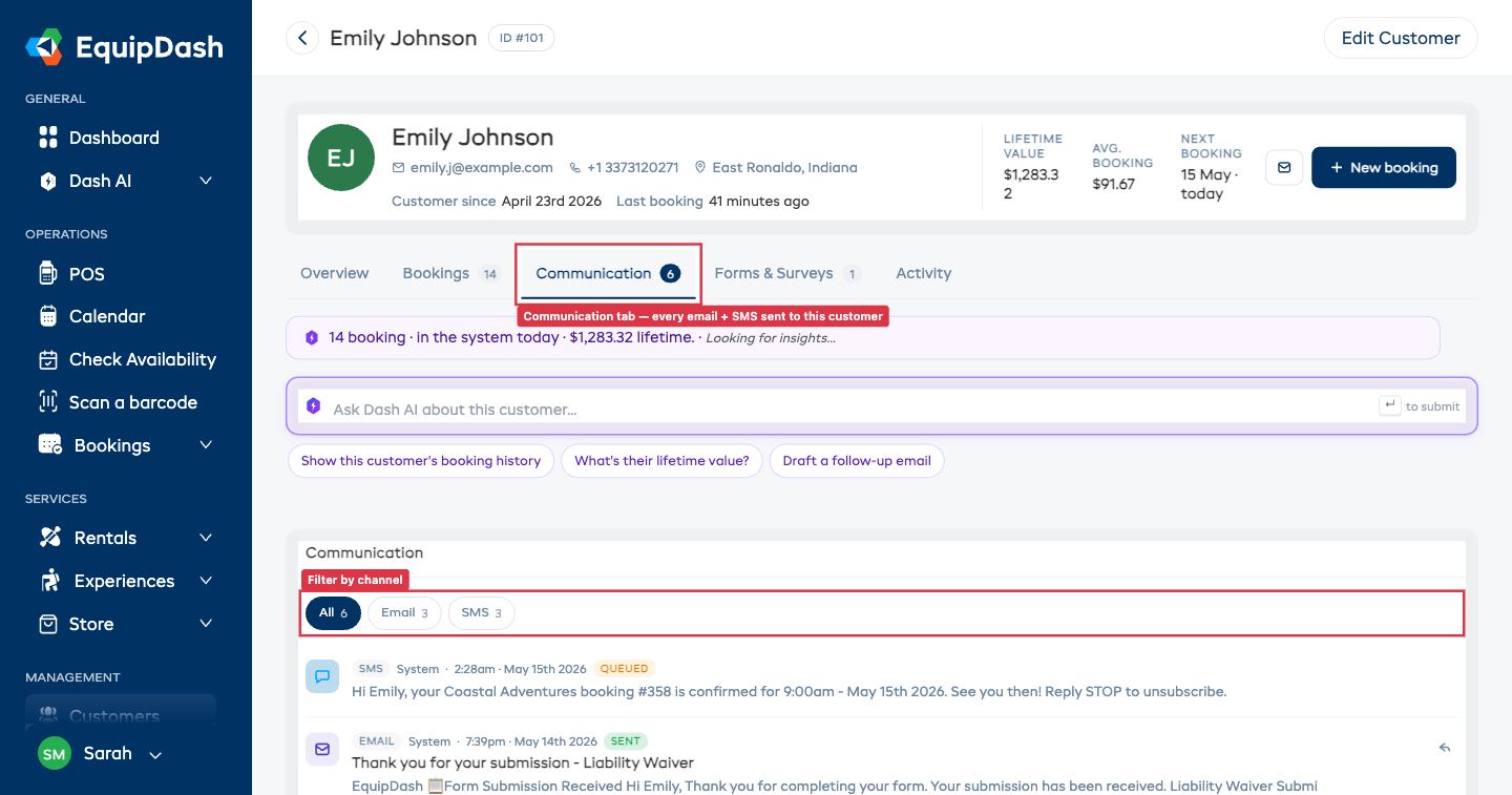
Each row shows:
- Channel pill (EMAIL / SMS).
- Sender ("System" for automatic emails, or the team member's name for manual sends).
- Timestamp.
- Status pill (SENT / QUEUED / FAILED / DELIVERED).
- Subject (emails only) and a short preview of the body.
- Reply icon (emails only) — opens the Send email side panel pre-filled with
Re: {subject}and the original email quoted below the cursor.
Filtering
The pill row at the top lets you narrow to one channel:
- All — emails and SMS together.
- Email — emails only.
- SMS — SMS messages only.
What's logged
System-sent emails (booking confirmations, payment receipts, overdue alerts, waiver requests, etc.) appear here automatically alongside any custom emails your team has sent. SMS messages logged via the EquipDash SMS integration also appear.
If a row shows FAILED, hover the warning icon (⚠) to see the failure reason.
Forms & Surveys Tab
Two cards stacked: Waivers & Forms at the top, Survey Responses below.
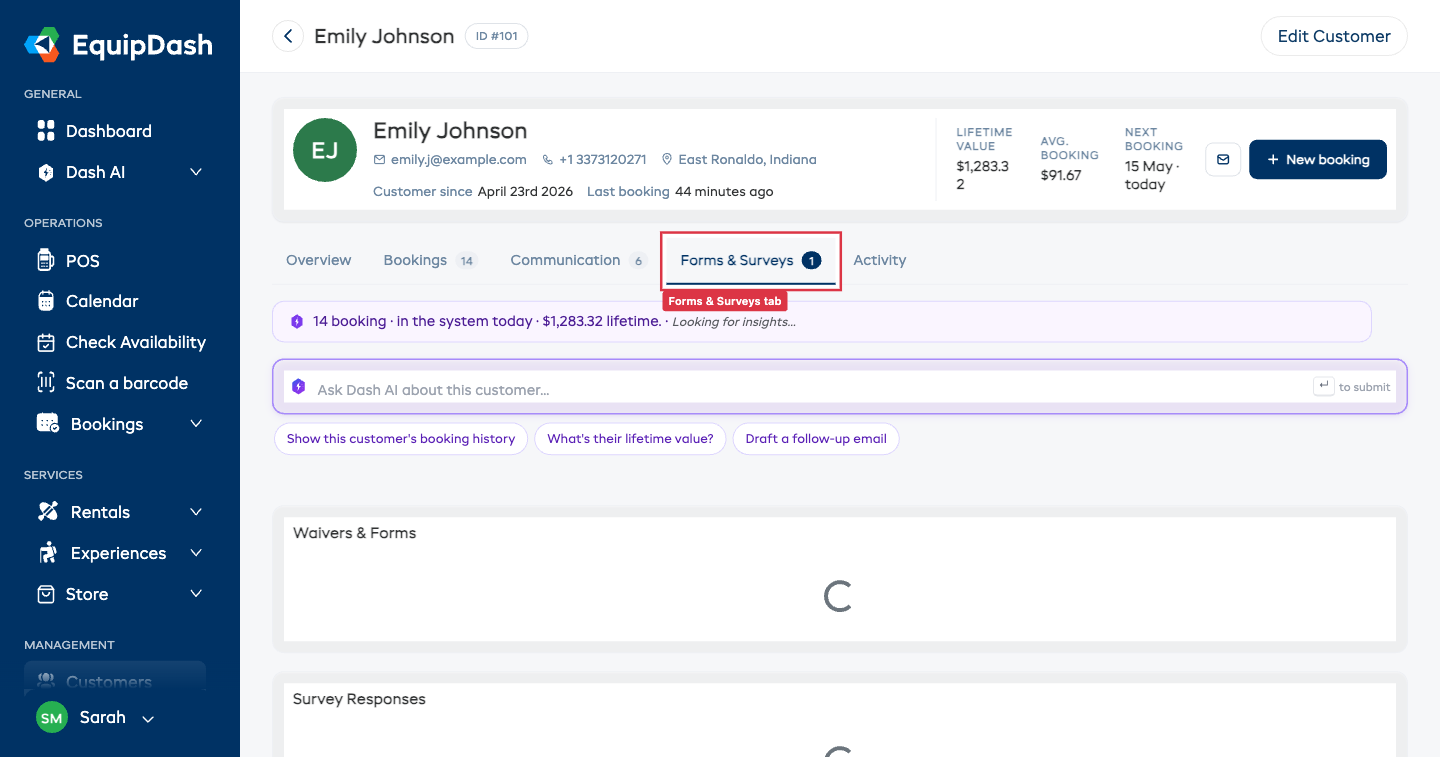
Waivers & Forms
A table of every waiver / form this customer has signed. Columns:
- Form Name
- Status — typically "Signed"
- Date Signed
- Linked Booking — booking ID this submission was attached to (if any)
- Actions — eye icon to view the full submission
Survey Responses
A table of every survey response (e.g. NPS feedback) the customer has submitted. Columns:
- Survey Name
- NPS Score — 0–10 rating (if applicable)
- Category — Promoter / Passive / Detractor (NPS classification)
- Date Submitted
- Linked Booking
- Actions — eye icon to view the full response
If the customer hasn't completed any forms or surveys, you'll see empty-state messaging in each card.
Activity Tab
A merged timeline of everything that's happened with this customer — bookings, payments, emails, SMS, waivers, surveys, and notes — sorted newest first.
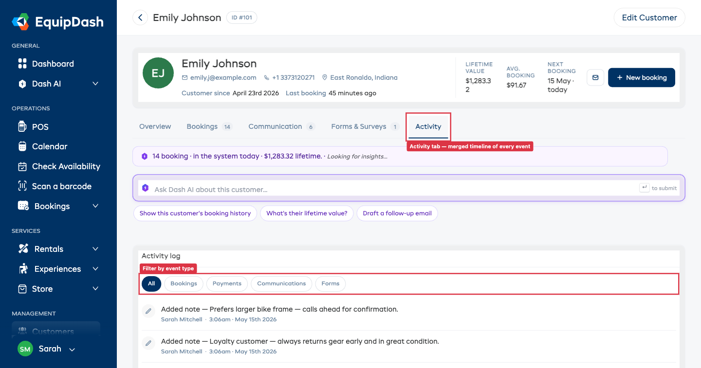
Each row has:
- Coloured icon — type-coded (booking events navy, payments green, communications purple, forms amber, notes grey).
- Event label — e.g. "Confirmed booking #353", "Payment $48.49 via stripe (booking #352)", "Sent email — Your booking is confirmed - #358", "Added note — …".
- Timestamp and an optional link to the related booking.
Filtering
The pill row at the top narrows the timeline:
- All — every event.
- Bookings — booking lifecycle events (created, confirmed, picked up, returned, completed, cancelled).
- Payments — payment receipts and refunds.
- Communications — sent emails and SMS.
- Forms — waiver / form / survey submissions.
The list paginates 25 rows at a time. Use the Newer ‹ / Older › buttons at the bottom to step through.
Header Actions
The page header has two action buttons:
- ← Back arrow — returns to the Customers list.
- Edit Customer — opens the full Edit Customer side panel (fallback for the inline-edit Contact card, plus the only way to set custom fields / DOB / gender).
Contextual CTAs (Send email, + New booking) live in the hero card on the right, not in the header.