Experience Reports
The Experiences tab in Reports focuses on your scheduled activities and tours. It helps you understand booking volume, group sizes, which experiences are most popular, and how your categories perform.
Opening Experience Reports
- Click Reports in the left sidebar.
- Click the Experiences tab.
You need the Reports Experiences permission to access this tab.
Stat Cards
The stat cards at the top summarise your key experience metrics for the selected time period.

| Card | What It Shows |
|---|---|
| Sales | Total experience revenue for the period |
| Bookings received | Number of experience bookings created during the period |
| Avg. experience duration | Average length of experience sessions (e.g. "2 hours") |
Bookings by Day of Week
The Bookings by day of week chart shows which days get the most experience bookings. It is a stacked bar chart with Start day and End day separated.
You can switch between By quantity (booking count) and By value (revenue) using the dropdown.
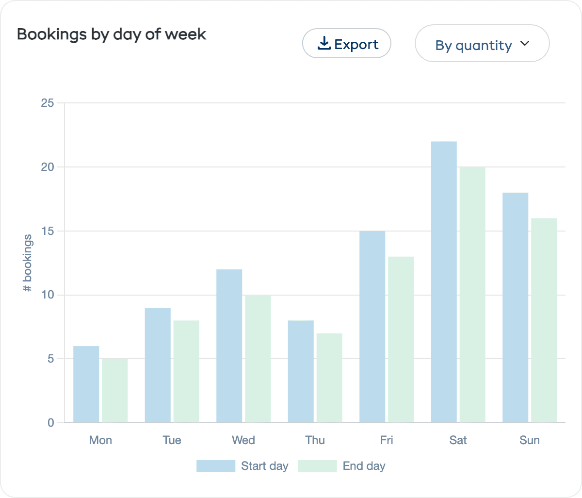
This is especially useful for:
- Schedule planning — Add more sessions on your busiest days
- Guide allocation — Make sure you have enough guides available when demand peaks
- Promotion targeting — Run deals on slower days to even out demand
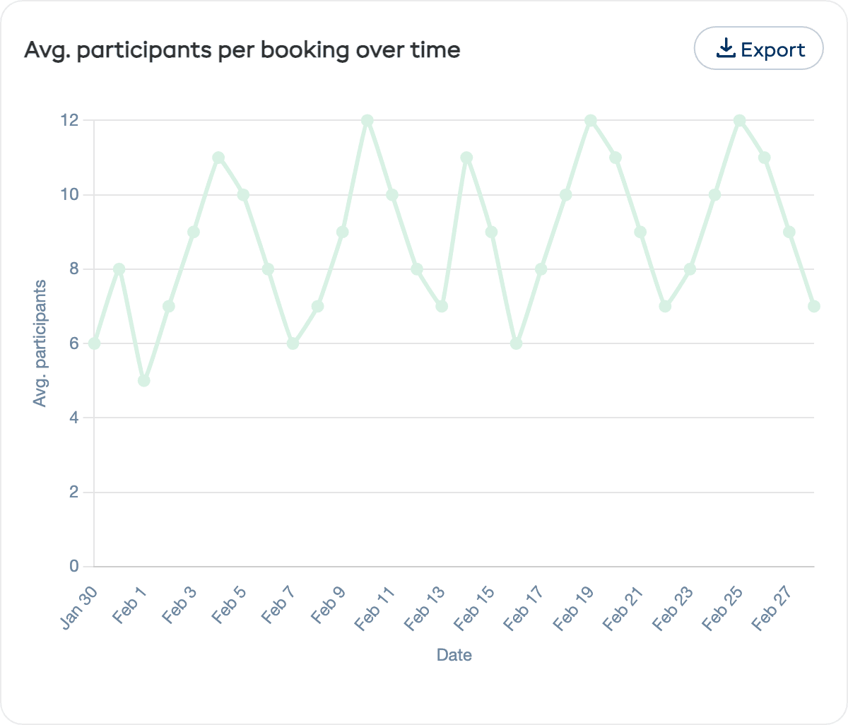
Avg. Participants per Booking Over Time
The Avg. participants per booking over time chart is a line chart showing the average number of participants per experience session across the period. This helps you understand:
- Whether your group sizes are growing or shrinking
- If you are running close to capacity (time to add more sessions) or well below it (opportunity to promote)
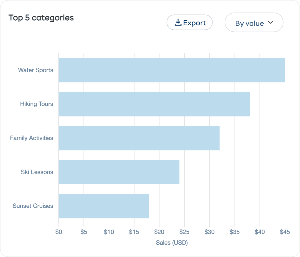
Top 5 Categories
A horizontal bar chart ranking your experience categories by booking count or revenue. If you organise your experiences into categories like "Water Sports", "Hiking Tours", or "Family Activities", this chart reveals where demand is strongest.
Use the By value / By quantity dropdown to switch views.
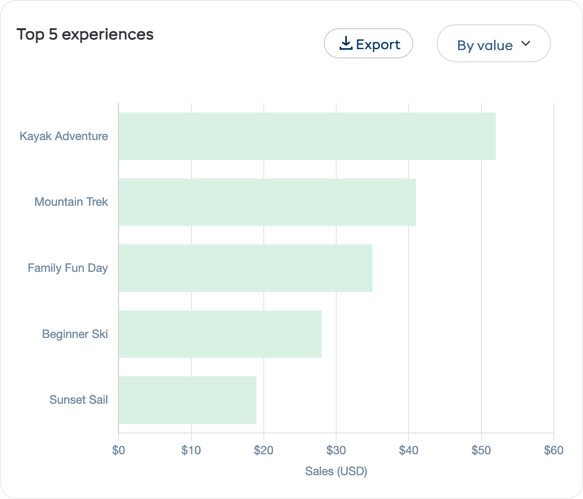
Top 5 Experiences
A horizontal bar chart of your most popular experiences by booking count or revenue. Use this to:
- Focus marketing on your proven winners
- Experiment with pricing on high-demand experiences
- Investigate low-performing experiences to understand why they are not filling up
How to Use Experience Reports
| Goal | What to Look At |
|---|---|
| Fill more sessions | Check average participants — if below capacity, increase marketing or adjust pricing |
| Optimise your schedule | Look at bookings by day to add sessions on busy days and reduce on quiet ones |
| Grow revenue | Focus on your top experiences and consider premium pricing or add-on options |
| Expand your offering | Top categories show what customers want — consider adding more experiences in popular categories |
| Plan staffing | Match guide availability to your busiest booking days |