Colors & Branding
Make the booking widget feel like a natural part of your website by matching it to your brand colors. The widget uses two configurable colors that control the appearance of buttons, links, accents, and body text.
The Two Color Settings
| Setting | What It Controls | Default |
|---|---|---|
| Primary Color | Buttons, links, active states, accents, and highlights | #0d3b66 (dark blue) |
| Text Color | Body text, labels, and descriptions | #303233 (dark gray) |
These two colors are all you need to give the widget a polished, on-brand look.
Changing Your Colors
- Go to Settings > Booking widget.
- On the Widget settings tab, find the Your brand section.
- Click the Primary Color swatch to open the color picker, or type a hex code directly into the text field (e.g.,
#FF6B35). - Set the Text Color the same way — click the swatch or type a hex code.
- That's it — every change saves automatically, so there's no Save button to click.
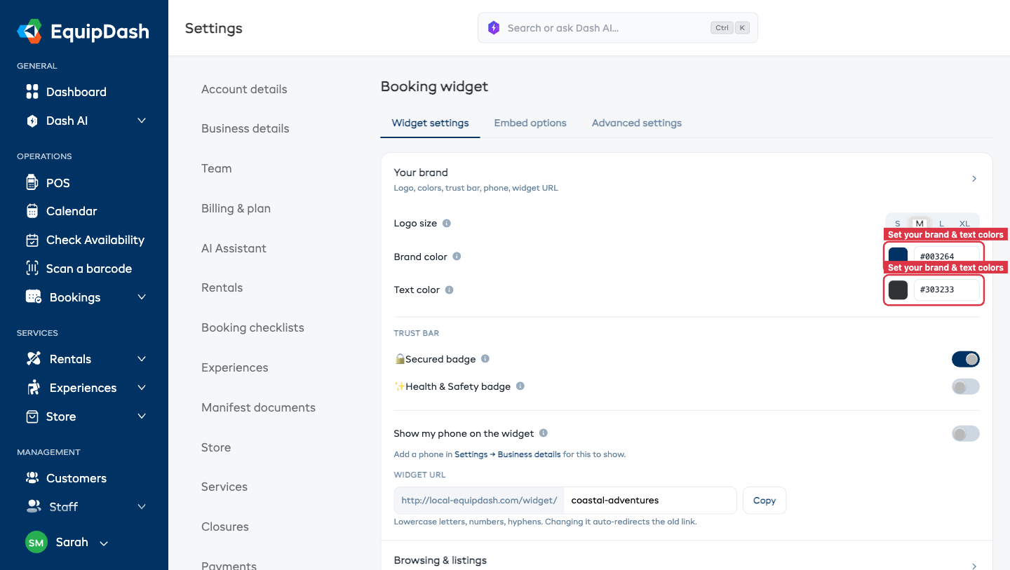
The changes take effect immediately. Any customer visiting your widget after the save will see the updated colors.
Logo Size
Your logo appears in the top-left of the widget header. You can choose how large it shows:
| Size | Best for |
|---|---|
| Small | Long, wide logos that already fill the space |
| Medium (default) | Most logos |
| Large | Logos that look a little lost in the header |
| Extra large | Square or circular logos — these sit in a short header bar, so they read smaller than a wide logo and usually look best bumped up |
To change it:
- Go to Settings > Booking widget.
- On the Widget settings tab, in the Your brand section, find Logo size.
- Pick the size that looks best — your change saves automatically.
- Open your widget to check the result — if a square logo still looks small, try the next size up.
A square logo will always look smaller than a wide "banner" logo at the same setting, because the header is a short horizontal strip. Choose Large or Extra large to give it more presence.
Choosing Good Colors
Primary Color
Your primary color should be your brand's main accent color — the same one you use for buttons and call-to-action elements on your website. This keeps the widget visually consistent with the rest of your site.
Tips:
- Use a color with good contrast against a white background, since the widget has a white/light base
- Avoid very light colors (like pale yellow or light gray) for the primary color, as buttons and links may be hard to see
- Test the color on both desktop and mobile to make sure it looks good at different screen sizes
Text Color
The default dark gray (#303233) works well for most websites. Only change this if your site uses a different standard text color.
Tips:
- Stick to dark colors for readability
- Avoid pure black (
#000000) if your website uses a softer dark tone - Never use a light color for text on the white widget background
Previewing Your Changes
After saving your colors, you can preview them instantly on the same page.
- Open the Embed options tab.
- A live Preview of the widget shows next to each embed type (Full widget embed, Product list, Single product, "Book now" button, Share a link).
- Check that buttons, links, and text all look right in the preview.
- You can also open the Share a link embed type and visit that link in a new browser tab to see the full widget.
Brand Consistency Checklist
Use this checklist to make sure your widget matches your website:
- Primary color matches your website's main button/accent color
- Text color matches your website's body text color
- The widget does not clash with the surrounding page when embedded on your site
- Buttons and links are clearly visible and easy to read
- The widget looks good on mobile