Must-Have Pages for Your Rental Business Website
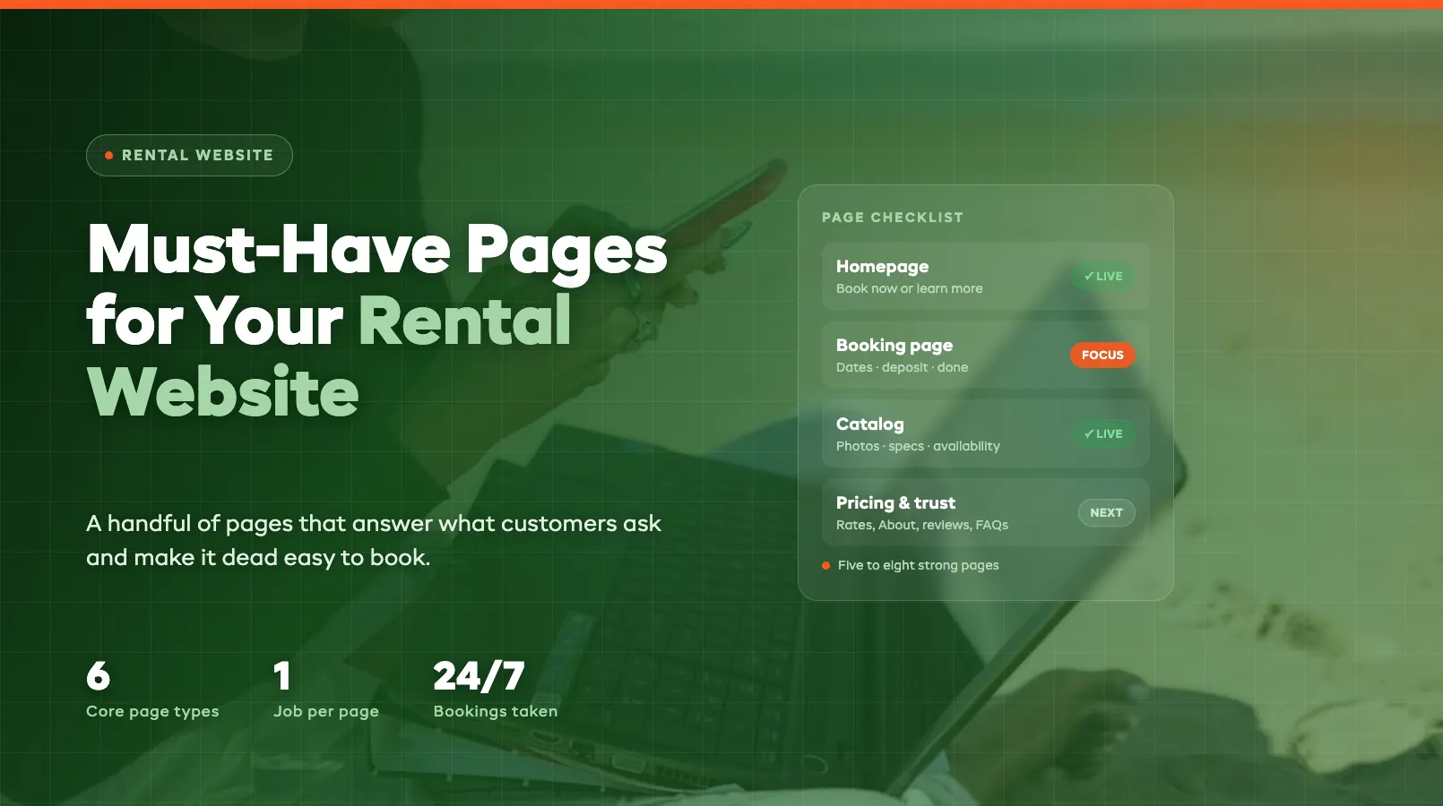
Your website is your busiest counter. It's open at midnight, on weekends, and while you're out delivering gear, and unlike your phone, it can take a booking without you lifting a finger. But only if it's built with the right pages, in the right order, doing the right jobs.
Most rental shops don't need a big website. They need a small one that works: a handful of pages that answer what customers ask and make it dead easy to book. This guide walks through the pages every rental business website should have, what each one is for, and the mistakes that quietly cost you bookings. If you're still getting the business off the ground, start with our guide on how to start an equipment rental business, then come back here to build the site that sells for you.
The Essential Pages
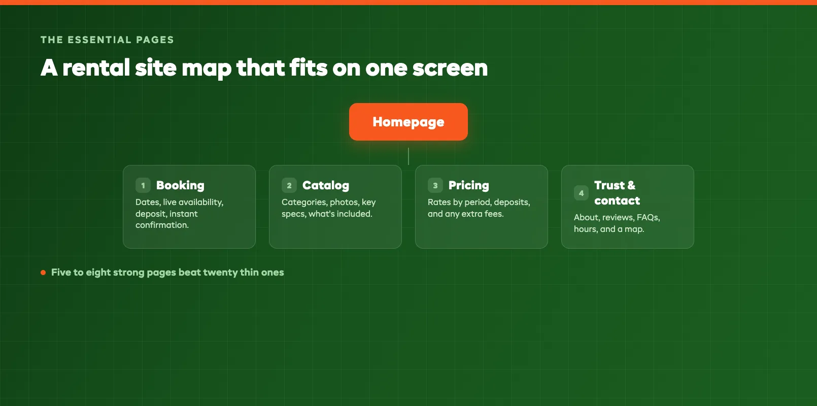
Forget the twenty-page site. A rental business converts best with a tight set of pages, each with one clear job:
- Homepage — the first impression and the fork in the road: book now, or learn more.
- Booking page: where the money happens. Dates, gear, checkout.
- Catalog / inventory: what you rent, with photos, specs, and availability.
- Pricing page: rates, deposits, and fees, in plain numbers.
- Trust pages: About, reviews, and FAQs that answer the "can I rely on these people?" question.
- Contact page: location, hours, phone, and a map.
That's it to start. Five to eight strong pages beat twenty thin ones every time, because search engines and customers both reward pages that fully answer a question over pages that half-cover ten.
Homepage: Focus on Bookings or Info?
This is the question every operator wrestles with, and the answer is: both, but in order.
The top of your homepage, the part people see before they scroll, should do one job: tell them what you rent and give them a way to book. A clear headline ("Paddleboard & Kayak Rentals in Lake Tahoe"), one strong photo, and a bright Book Now button. Ready-to-buy visitors shouldn't have to hunt.
Below that, switch to information. This is where you win the browsers — the people who aren't sure yet. Show your gear categories, a few popular items, how the process works (pick, book, collect), a line or two on delivery, and a couple of reviews. You're answering their quiet questions before they have to ask.
The mistake is picking one or the other. A homepage that's all booking button feels pushy and thin. A homepage that's all story makes the ready buyer scroll and scroll for a way to reserve. Lead with the booking path, back it with the info.
Booking Page: Reducing Friction
Your booking page is the most important page you own, and friction is its enemy. Every extra field, every confusing step, every "call us to confirm" is a place where a customer gives up.
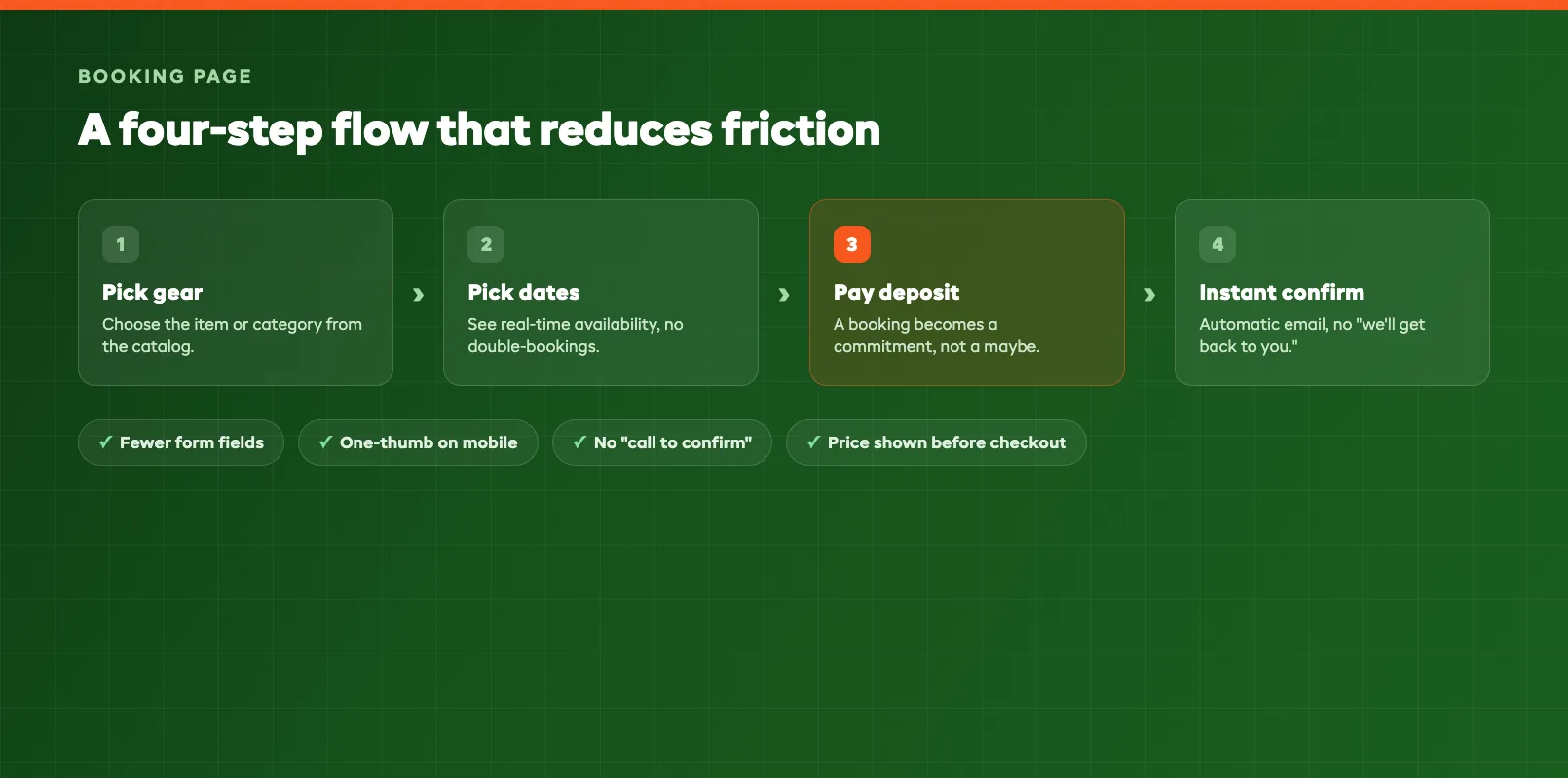
A good booking flow is short and obvious: pick the gear, pick the dates, see live availability, pay a deposit or the full amount, done. It should work on a phone with one thumb, because most of your customers are booking from one. If the page asks for a passport number and a life story before it shows a price, people bail.
A few things that cut friction fast:
- Show real-time availability so nobody books gear that's already out.
- Ask only for what you need: name, dates, contact, payment. Save the rest for later.
- Take deposits online so a booking is a commitment, not a maybe.
- Confirm instantly with an automatic email, not a "we'll get back to you."
If your site can't do this yet, the fix is usually a booking system rather than a bigger web design budget. Our guide on how to add online booking to your rental website walks through the options.
Inventory / Catalog
Your catalog is where customers decide what to rent. It doesn't need a page for every single unit. It needs to help people choose and move on to booking.
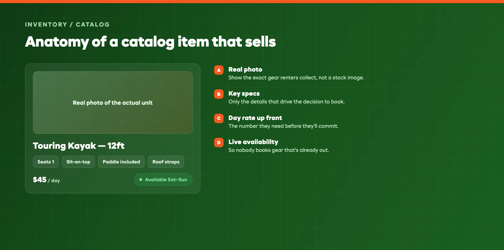
Group your gear into categories that match how people shop: by type (kayaks, paddleboards), by use (family day out, backcountry), or by size. Within each category, show the details that actually drive a decision: a clear photo, the key specs, what's included, and whether it's available for the dates they want. A photo of the real item beats a stock image every time; renters want to see what they're actually getting.
You don't have to expose your entire back room. Show the categories and popular items, keep availability live, and let the booking flow handle the specifics. The goal is a customer who thinks "that's the one" and reaches the checkout without a single email.
Pricing Page: Transparency Wins
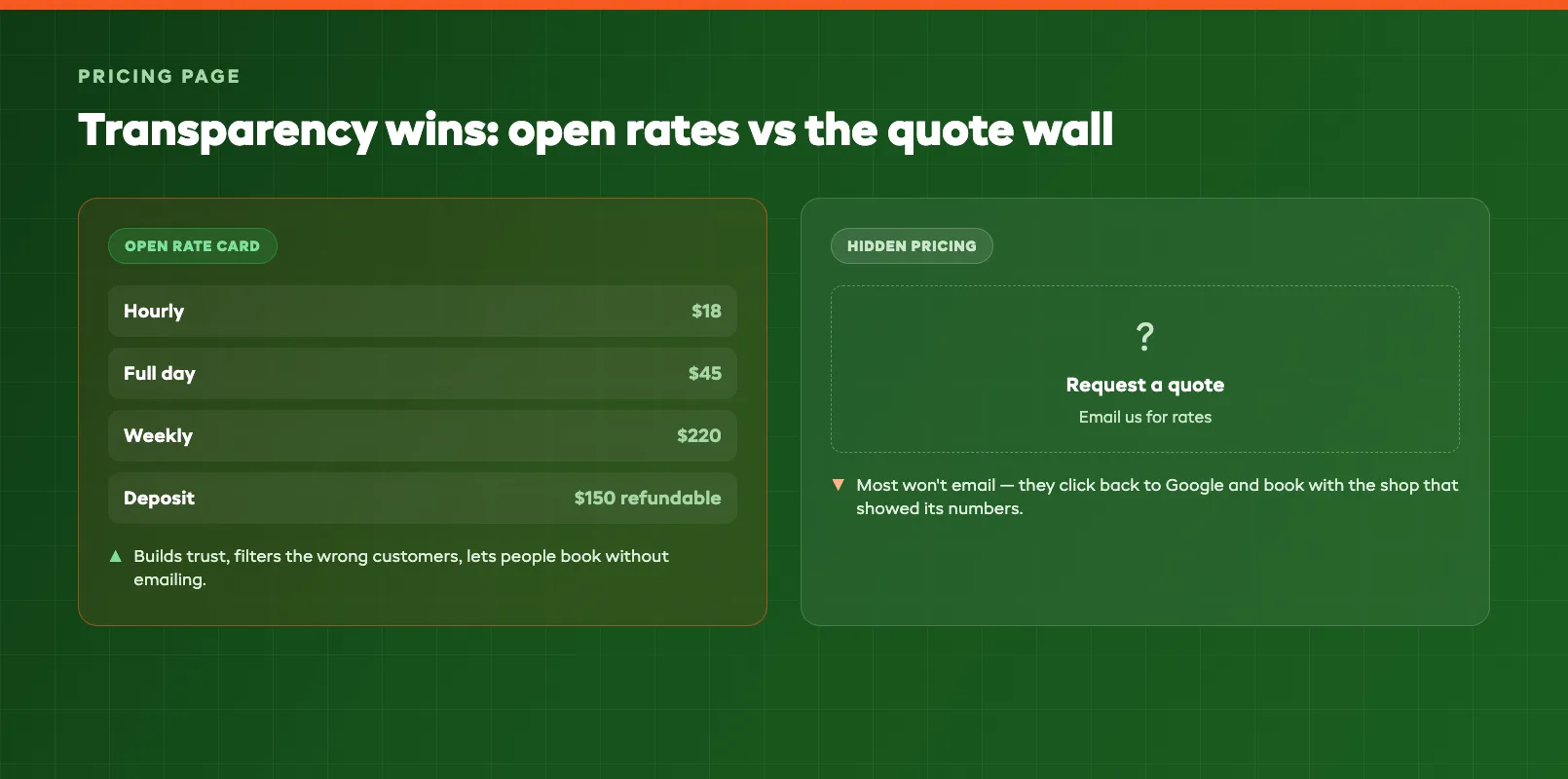
Hidden pricing is one of the most expensive mistakes a rental site makes. When someone has to email for a quote, most won't. They'll click back to Google and book with the shop that showed its rates.
Put your numbers on the page: rental rates by period (hourly, daily, weekly), deposit amounts, delivery or cleaning fees, and anything else that hits the final bill. If you offer discounts for longer rentals or multi-item bookings, show those too. They're a reason to book more, not less.
Transparency does two jobs. It filters out the wrong customers before they waste your time, and it builds trust with the right ones, who feel like they're dealing with a straight shooter. The only real exception is genuinely custom work (large events, corporate contracts) where a "request a quote" path makes sense alongside your standard published rates.
Trust Pages: About, Reviews, FAQs
Renting means handing over gear and, often, a deposit. Customers want to know you're real and reliable before they commit. Three pages do that work.
About: a short, human page. Who you are, where you're based, how long you've been renting, and a real photo of you or your shop. It doesn't need to be long; it needs to feel like a person, not a faceless website.
Reviews: social proof is the closer. Pull in Google reviews, add a few testimonials, and don't hide the page. New customers trust other customers more than they trust your marketing.
FAQs — the page that answers the questions your phone rings about: deposits, damage, cancellations, delivery, ID requirements. A good FAQ page cuts your admin and helps you show up in search, because these are the exact questions people type into Google. It's a quiet SEO win — worth reading our guide on rental business SEO to make the most of it.
Common Mistakes
A few patterns show up on rental sites again and again. Avoid these and you're ahead of most of your competition:
- No visible booking button. If people have to call to reserve, you lose the ones who found you at 9pm.
- Hidden or "request a quote" pricing on standard rentals. It slows the sale and buries you in emails.
- Stock photos instead of your real gear. Renters want to see what they'll actually collect.
- A site that breaks on mobile. Most bookings happen on phones; a fiddly mobile site kills them.
- No availability shown, so customers book gear that's already out and you spend the day untangling it.
- Too many pages, all thin. Twenty half-finished pages rank and convert worse than eight strong ones.
Putting It Together
You don't need a sprawling website to win rental bookings. You need a focused one. A homepage that leads with booking, a friction-free booking page, a catalog that helps people choose, a pricing page that shows its numbers, and trust pages that prove you're the real deal. Get those five jobs right, keep it fast on mobile, and your website starts doing what your counter can't: taking bookings around the clock.
FAQ
What pages does a rental business website need?
At a minimum: a homepage, a booking page, a catalog or inventory page, a pricing page, and trust pages like About, reviews, and FAQs. Add a clear contact page with your location and hours. Everything else is optional until those core pages are earning bookings.
Should my rental homepage focus on booking or information?
Both, in order. Lead with a clear headline and a booking button above the fold so ready-to-buy visitors can act immediately, then use the rest of the page to answer the questions that convince browsers: what you rent, how it works, and why people trust you.
Should I show all my inventory online?
Show enough to help people choose: categories, popular items, photos, key specs, and live availability. You don't need a page for every single unit. Group similar gear so customers can compare and book without feeling overwhelmed.
Do I have to publish my prices?
In most cases, yes. Hidden pricing makes people leave or email you for a quote, which slows the sale and buries you in admin. Clear rates, deposit amounts, and any extra fees build trust and let customers book without a back-and-forth.
How many pages should a rental website have?
Start with five to eight strong pages rather than twenty thin ones. A homepage, booking page, catalog, pricing page, About, reviews, FAQs, and contact page cover what most rental customers need. Add more only when a real customer question justifies it.
What is the biggest rental website mistake?
Making people call or email to book. Every extra step between wanting your gear and reserving it loses customers. A visible booking button, clear pricing, and real-time availability remove that friction and capture bookings while you sleep.
in one place